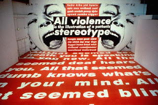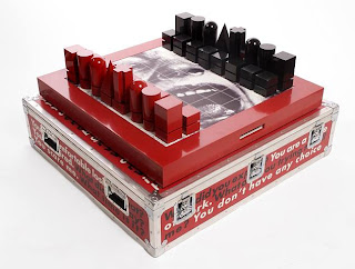


1. The above image is a typical example of Kruger’s earlier pieces where they were usually a B/W photograph overlaid with declarative captions in white-on-red Futura Bold Oblique font. The below image is a photograph of ‘Between Being Born & Dying’ (2009) an installation of Kruger’s. It is very evident she has moved away from the 'poster' type pieces and is now working with a very large scale installation. Although aspects remain the same e.g. Font, boldness of text she has covered walls and pillars of the Lever House in text. Kruger says that she wanted the viewers to experience her working their own space and be engulfed by the work. She has explored a new angle and changed with the ever changing contemporary art world. 2. I think the audience can experience spatial/installation work in a very firsthand basis. Viewers are able to interact by walking in and around the space and discovering it as they go. They become part of it and are enveloped into the work. Whereas a poster work has the effect of taking it all in at once and is very much a lifeless inanimate object. Quick and easy to experience and then move on. 3. Particularly in her earlier poster work she used a lot of pronouns like "You", "I", "Your", "We" and "They" which grab the viewers attention as it addresses them personally or we as a group, the viewer is included. Also the black and white use and the bold red and strong font all contribute to grabbing the viewer’s attention. Similarly in more recent works she uses a limited palette and the same strong bold fonts.
4. Over the past thirty years Kruger has not so much 'developed' her work but rather maintained its relativity and adapted as the times have changed. The biggest change would have to be the move from 2d and video to installation.
I like how you point out the reason that she has moved away from the small poster size art works to larger scales was to engulf the viewers of her work. I think that it was a very wise move for her as it gave more power to the impact in how she wasgetting acros her messages. Also it was a very smart move to use video intalations as it is the most consumed form of media in todays society. The way that you have said that the video allows them to be enveloped by the work thoug its experience where as just a simple poster is hard to take in all the messages its trying to send to the audience at once.
ReplyDelete[untitled (between being born and dying), 2008]
ReplyDeleteIt is recent work in her works for Moderna Museet’s 50th anniversary in 2008.
It was installed in museum by posters. she used images which was taken by her and text. The expression which was mixed photos and words or sentences usually shows black and white photos and the red and white texts. This work is poster style but it looks like interior or installation art in the museum as well. I think this work was made more develop by her than existing other works.
I think spatial art and installation are 3D works which show three-dimensional structure but 2D works such as visual art and graphic art like poster which show flat structure. When 3D artist make works, they always use materials which can be solid things so viewers feel various things in one space. On the other hand her work looks like 3D but her material or her expression ways is 2D. She made by both 2D and 3D so audience experience is more spatial than existing other 2D and 3D works.