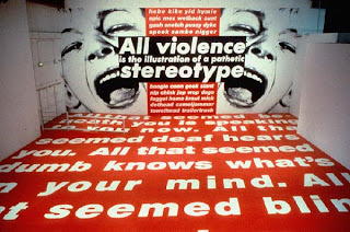

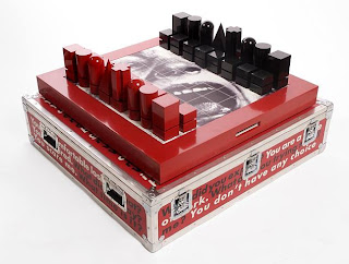
1. The above image is a typical example of Kruger’s earlier pieces where they were usually a B/W photograph overlaid with declarative captions in white-on-red Futura Bold Oblique font. The below image is a photograph of ‘Between Being Born & Dying’ (2009) an installation of Kruger’s. It is very evident she has moved away from the 'poster' type pieces and is now working with a very large scale installation. Although aspects remain the same e.g. Font, boldness of text she has covered walls and pillars of the Lever House in text. Kruger says that she wanted the viewers to experience her working their own space and be engulfed by the work. She has explored a new angle and changed with the ever changing contemporary art world. 2. I think the audience can experience spatial/installation work in a very firsthand basis. Viewers are able to interact by walking in and around the space and discovering it as they go. They become part of it and are enveloped into the work. Whereas a poster work has the effect of taking it all in at once and is very much a lifeless inanimate object. Quick and easy to experience and then move on. 3. Particularly in her earlier poster work she used a lot of pronouns like "You", "I", "Your", "We" and "They" which grab the viewers attention as it addresses them personally or we as a group, the viewer is included. Also the black and white use and the bold red and strong font all contribute to grabbing the viewer’s attention. Similarly in more recent works she uses a limited palette and the same strong bold fonts.
4. Over the past thirty years Kruger has not so much 'developed' her work but rather maintained its relativity and adapted as the times have changed. The biggest change would have to be the move from 2d and video to installation.


